Live case
Client: SVT
Agency: Perfect Fools
Designer: Evelina Lindahl
Producers: Amit Raab, Carl Berglind
Brief: Make a new illustration for the error message screen in order for it to align better with the visual identity.
It should read as being a part of the app identity and not the competition as a whole.
It should read as being a part of the app identity and not the competition as a whole.
INSPIRATION

In order to specifically adhere to the branding of the Melodifestivalen app I used visual elements from the app as my inspiration. In that I came to the conclusion that the colours that make up the different voting age groups and the icon for the TV function are the most recognizable elements that also carry a lot of character.
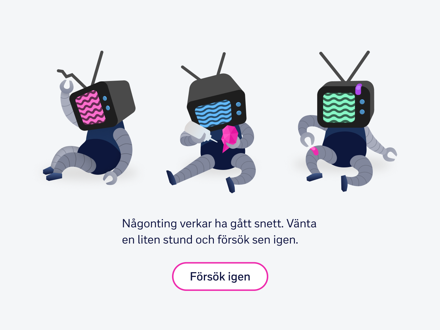
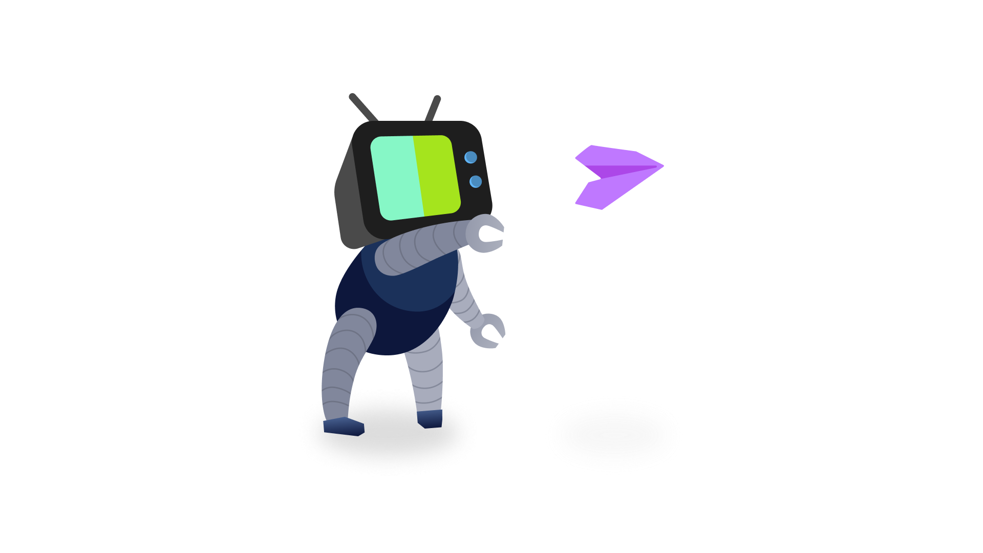
The ERROR BOTS
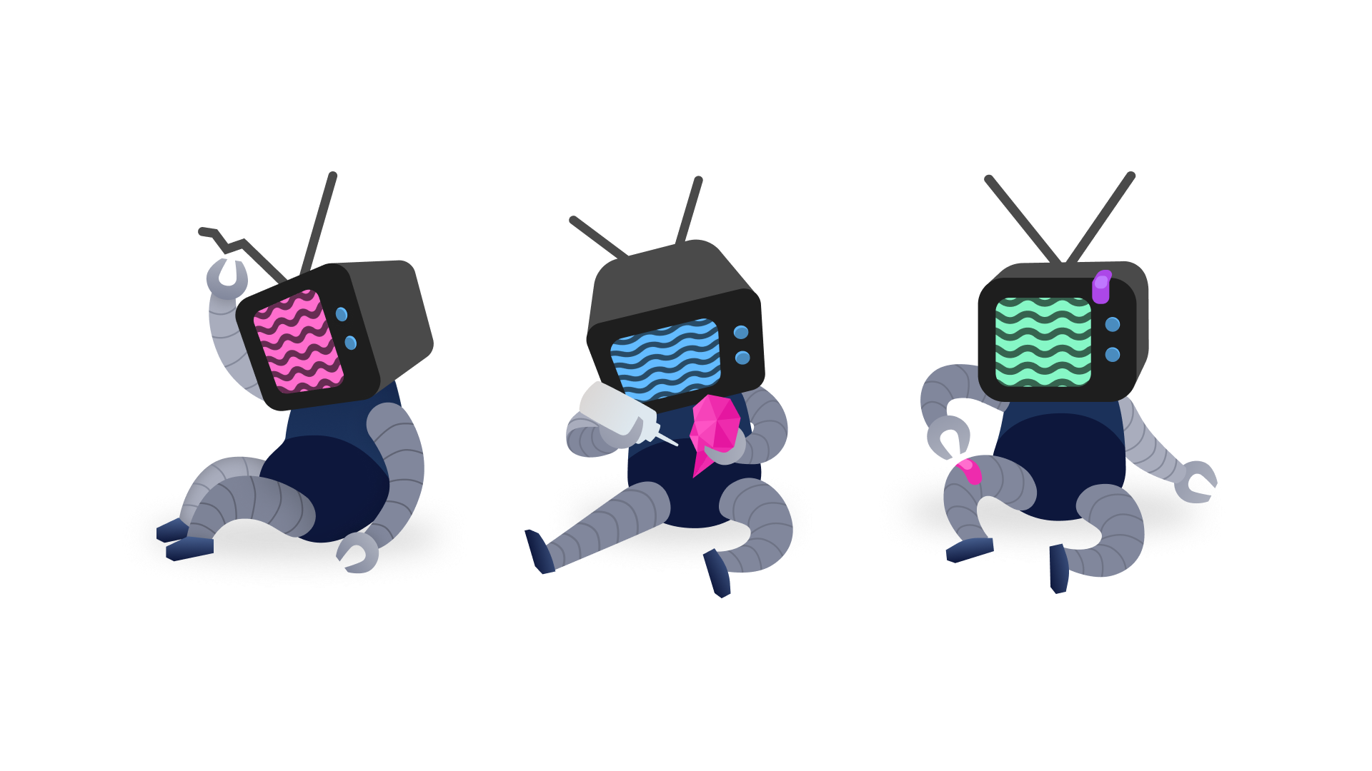
I kept the robot element of the previous screen but made it into a relatable character that would lighten the mood when something has gone wrong. It is vivid and fun like the app, but it also communicates that there has been a mishap.
The robot has a TV head that is borrowed from the TV icon and the screen shows it's missing signal in one of the age group colours.
The activities the Error Bots do are all tied to some kind of mishap and in some cases I've brought in other elements that would be related to an app user, like the heart being broken and dropping your popcorn bucket.
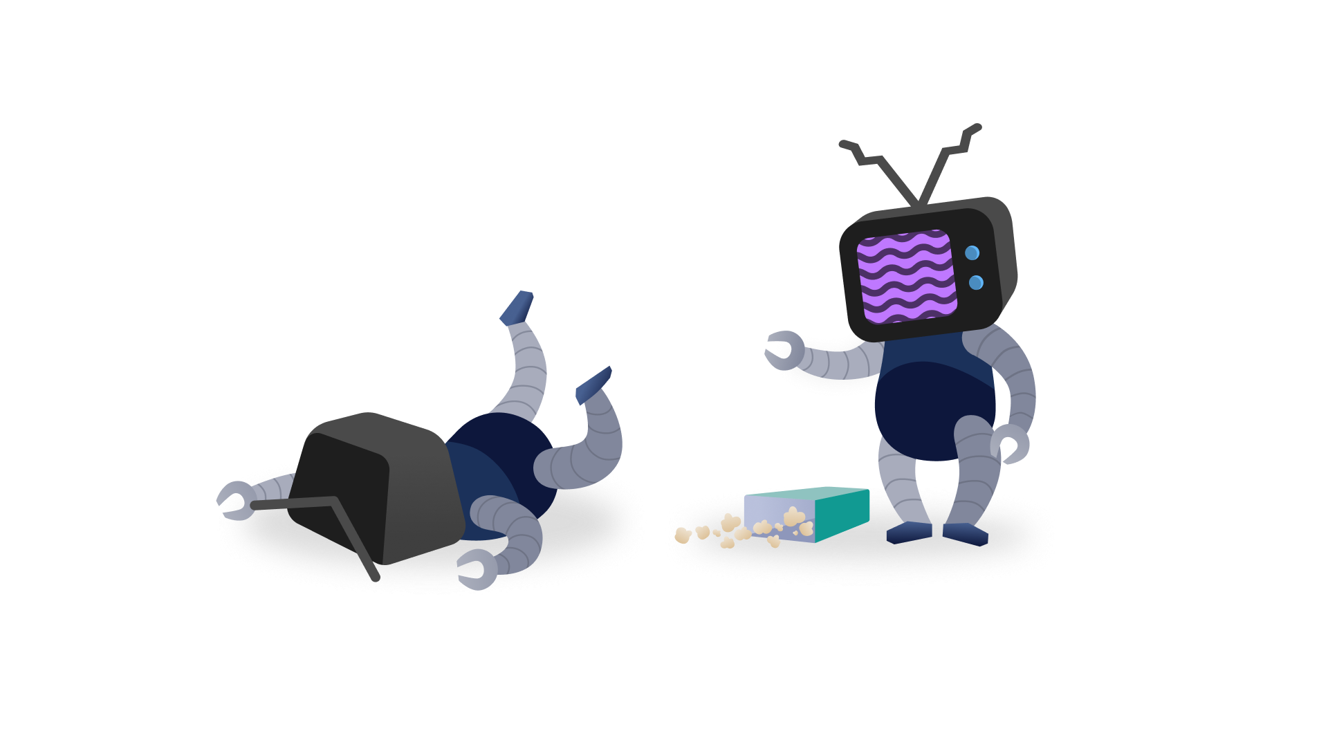
THE parental approval BOT
When updating the log in experience a visual element was needed for the parental approval screen and since the Error Bots were received well by the client I was asked to make a robot for this as well.
This of course would have to be a functioning robot so the visual elements indicating it being broken were removed, i.e. the robot would not have a broken antenna, it would be succeeding with its activity and the signal would not be missing.
Since the colours are tied to age groups I also wanted to make sure the colours in the robot screen aligns with the age groups in question.