Live case
Client: Stryktipset (Svenska Spel Sport & Casino)
Agency: Perfect Fools
Designer: Evelina Lindahl (The spine, back cover and book interior were designed by Niklas Lindblad of Mystical Garden Designs)
Art Director: Karl Nord
Producer: Hannah Bradford
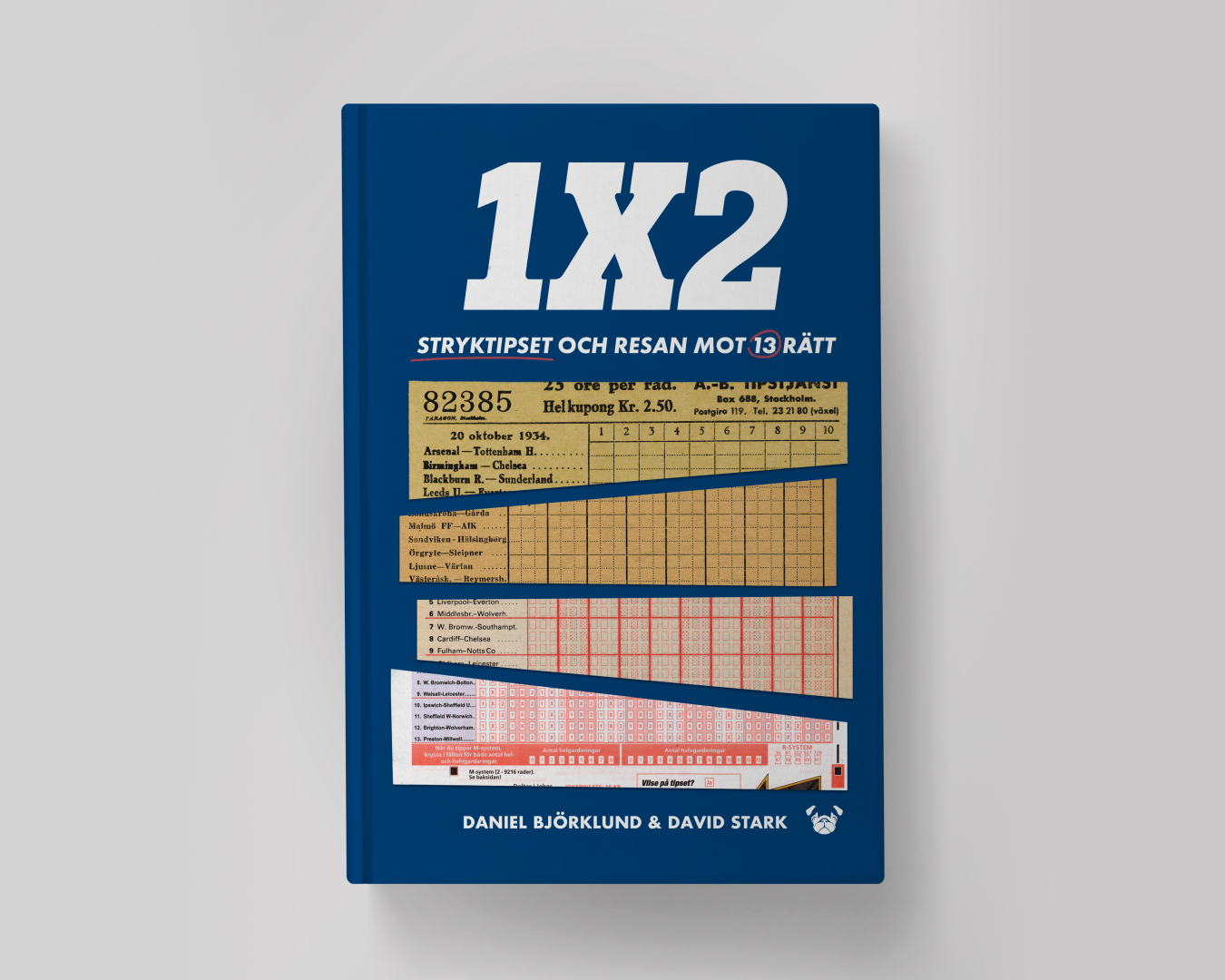
Brief: Design a front cover for a book about the history of Stryktipset for their 90th anniversary. The book is named 1X2: Stryktipset och resan mot 13 rätt.
Challenges: Between famous profiles that would need rights renewal and unsure origins of old photographs Stryktipset are quite limited in images they have rights to from their past.
INSIGHT
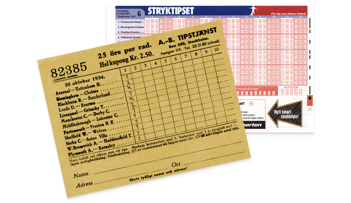
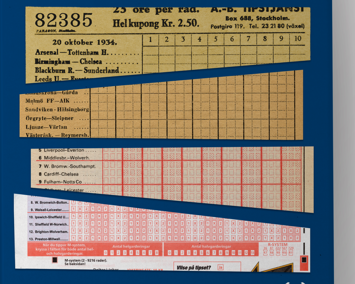
The client has a strong emotional and brand connection to their betting coupons which have been with them from the very beginning. The design changes throughout the years show a clear progression of time. Nowadays the betting coupons are only online based, but the physical betting coupons are missed by many.
SOLUTION
By highlighting betting coupons from different periods in Stryktipset’s history we evoke a nostalgic feeling in those who have fond memories associated with them and also hint to the biographical nature of the book.
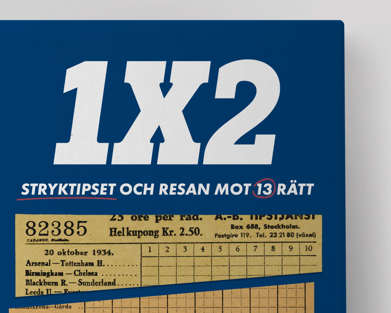
The type evokes a similar vintage nostalgia and carries a sporty feeling with its heavy weight and thick serifs. Stryktipset is underlined for emphasis and 13 is circled to hint at the 13 symbol that they use in their branding. The sketchy lines also contribute to the coupon imagery bringing in an element of how they are interacted with.
The colours are from Stryktipsets branding, but whereas the background colour usually is a brighter blue in Stryktipset, the darker blue is chosen here for contrast. The darker blue together with the red is also reminiscent of the UK flag, a symbol often used with Stryktipset.